Designing websites, or designing anything in general has always been difficult for me. My friend Derek from perpetual.education (a 6 month web development and web design mentorship) suggested I make a visual inspiration folder.
Here are some of the visual inspirations I’ve collected so far
1. Section accents
A bland section of a website made visually interesting with 2 accents. The top right accent is repeated on the bottom left, with the colors inverted. Visual symmetry seems important.
2. Header accents
What would otherwise be a bland dark page is brought to life by bright colors, and a simple drop shadow on the heading. The skewed buttons are also neat.
3. Image and Text Balance
First section: text first, image second. Second section: image first, text second. Third section: pure text. Everything is balanced out evenly. Visual symmetry.
4. Breaking up sections
The slant, slant, straight, slant between each section with alternating colors breaks up the page and makes it visually appealing. A neat little trick. (Also, notice how the images in the second section are slanted the same direction as the first section)
5. Denoting important links
A bold green underline (can be any color that goes with the theme), when hovered it covers the entire text. Normal links when hovered will just change to green colored font (or whatever color that goes with the theme)
6. Icons
Each of these icons are different sizes. Place them inside of a box though, and they visually look the same.
7. Another way to break up sections
The use of colors in each section is what caught my attention. The use of a darker color variation to separate the content was a neat little trick.
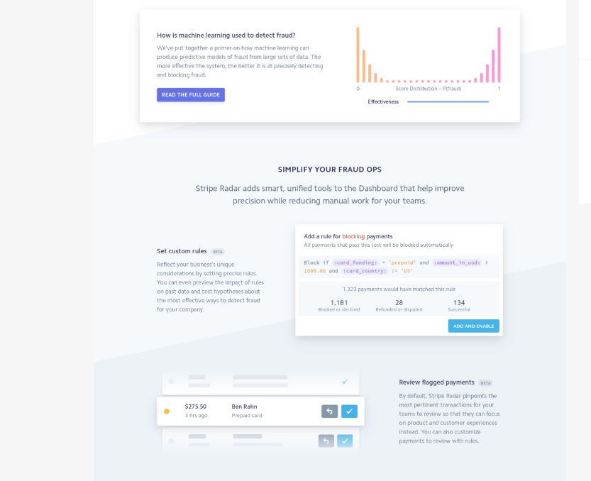
8. Section overlapping
Each section is progressively getting darker. Each section is broken up by a slant. The previous section has an image overlapped onto the next. Each section is balanced: Big image… text —> image… image —> text. Visual symmetry is starting to look important.
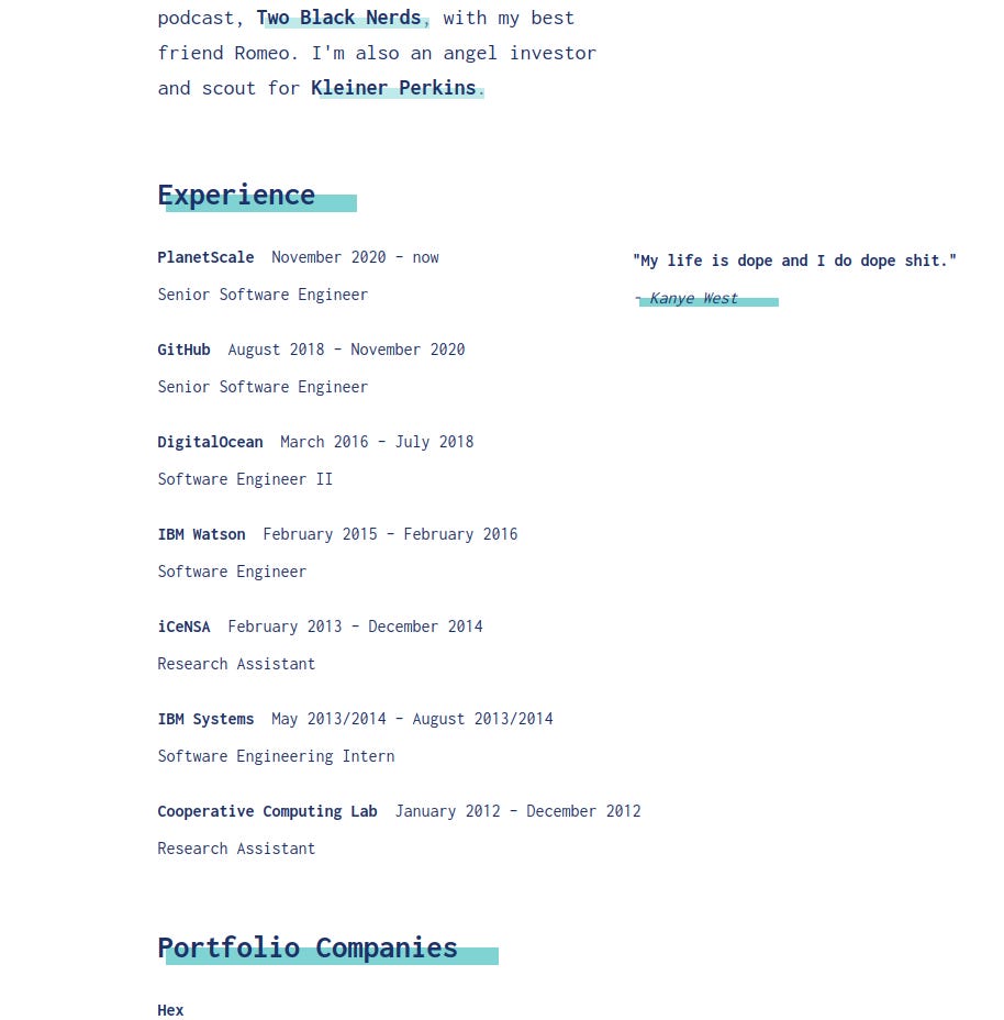
9. Highlighter-like underlines
Not sure what it is, but I’m liking this underline effect… It reminds me of a highlighter, marking something as “important”. Draws my attention instantly to “Experience” and “Portfolio Companies” and makes me (the reader) think they are something important / something I need to pay attention to.
Maybe these could be tricks as opposed to inspiration, but they give me an idea of things that work. They’re cool little ideas I can incorporate or expand on in the future, and maybe you can too!
Nice! PE is putting together a resource called "techniques" where we'll collecting things like this and expanding on them with examples and also tips on how to implement them / and when it's a good or bad time to do so. I bet you'll be adding a bunch.


Nice! PE is putting together a resource called "techniques" where we'll collecting things like this and expanding on them with examples and also tips on how to implement them / and when it's a good or bad time to do so. I bet you'll be adding a bunch.
This is inspiring me to write a similar article to showcase my visual design folder. Nice article !!